Weaving a web
Designing Rungh Redux for discovery
Share Article


Zool Suleman, editor of Rungh, heard about the project from artist Simranpreet Anand in 2019 and reached out to me. He was wondering if the basic idea behind Intuition Commons — showing a web of linkages between artists through their art — might be readily applied to visualize the history of Rungh Magazine, which was printed in the early 1990s. The design challenge was to use the same node-based network to show the history of Rungh Magazine, its contributors, and the linkages between them. The intent was to have curiosity lead to discovery and discovery lead to insight.
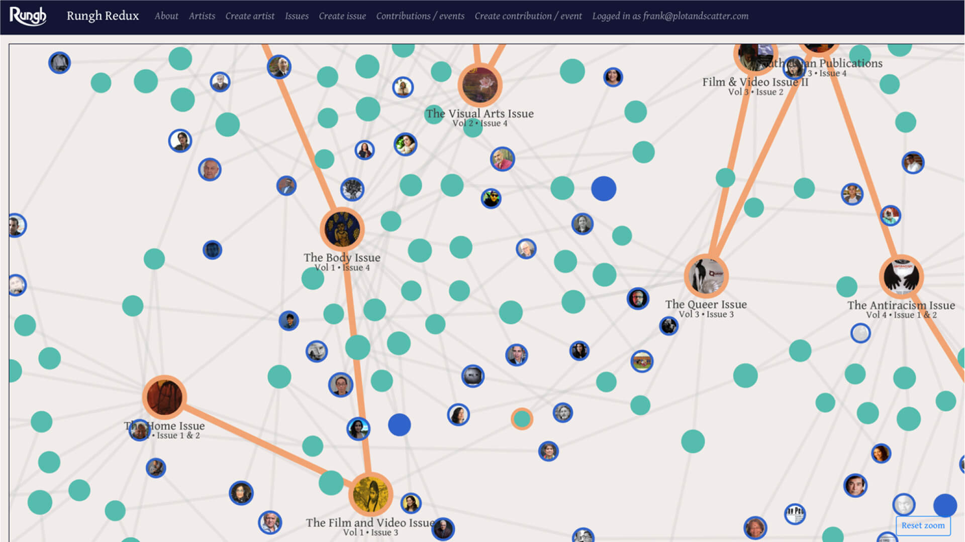
The first iteration of Rungh Redux kept the idea of artist nodes and used contributions by various artists as the link to various issues of the magazine. A third node type, to represent issues, was added.

The design at this prototype stage was almost identical to that of Intuition Commons, with the main changes being to node size and colour. We decided to expand the project. While not obvious to an end-user, a critical piece of the project at this stage was a robust editing interface, allowing a Rungh editor to add in nodes and links between them, with the underlying data all stored to a backing database.
This editing interface, and even more importantly the data collected through it, became the foundation of Rungh Redux. Without good, clean data to visualize, the prototype would remain little more than a proof of concept. Though back issues of Rungh Magazine had been digitized via full-page scans and an OCR process, there was still no in-depth semantic tagging of the digitized data. Amina Creighton-Kelly, a member of the Rungh project team, worked to manually enter the artists, contributions, and issues, to link them all together correctly, and to add in images where appropriate.
After the data entry process, and some further revisions to the visualization, a new Rungh Redux began to emerge. We decided to make the nodes more engaging by putting the headshots of the artist on each node circle. We also chose to emphasize a “spine” in the network: the magazine issues themselves, which link to each other sequentially.

But after spending some time with the visualization, the project team realized that it wasn’t quite telling the story of Rungh Magazine in the way we wanted.
For one thing, the spine was inevitably contorted. Without getting too deep into the technical aspects, we found it difficult to keep a reasonably straight line of nodes in a force-directed graph without making significant changes to the codebase. But even beyond this problem, we felt more deeply that the density of nodes made the user experience overwhelming. The "rhizomatic" appearance of Intuition Commons worked well for that project, which was intentionally without a "centralizing" feature or a sense of linear time. In addition, Rungh Redux nodes would have to be hovered over to reveal the name of the artist or the title of the contribution, but this deterred discoverability. Moreover, the whole diagram was very difficult to adapt neatly to mobile devices. In short, we became concerned that the site visitor would be overwhelmed: "What is this trying to show me? Where do I begin? This is too much."
We realized that a significant part of the problem was that our goal, which was to offer a retrospective glance into the history of Rungh Magazine (a relatively linear thing, by its nature), was not very well-represented by a somewhat chaotic network graph. My friend and frequent collaborator Milène Vallin (who had also worked on the design of Intuition Commons) joined the project to help us reconceptualize the appearance of Rungh Redux. How could we develop a visual system that would better represent the magazine's history, without being visually overwhelming, while retaining the sense of exploration and linkage between nodes?
After a few sketches we came up with a fairly radical revision to the design of Rungh Redux:

On desktop, each node type would get its own column in a “triptych” of “tapestries”. This would also translate nicely to mobile, where users would be able to view one tapestry at a time and switch horizontally between them. Nodes themselves would have both compact and expanded modes. The compact mode would allow users to skim issues by theme, contributions by title, and artists by name. If one caught their interest, they could click or tap to expand the node and follow the links through to the related issues, contributions, and artists.
One nice visual framing motif was the “frieze.” Nearly every issue of Rungh Magazine had a graphic design along the border of the page, and we thought we could adapt this to bring some visual interest to nodes which would otherwise appear quite static and text-heavy.
This design iteration appealed to all of us. It solved the main problems with the network visualization, while still retaining a sense of playfulness and exploration. It also engaged with Rungh Magazine’s design roots and original design team of Sherazad Jamal, Dugg Simpson and David Laulainen. However, we realized one more flaw: the contribution nodes, in particular, were just not particularly engaging. Content needed to be added to Rungh Redux in some manner to engage the user’s interest and to spur further curiosity — ideally, leading the visitor to read the full article on the Rungh platform.
We decided to expand the scope of the project and clean up the OCRed text of the articles. This was a large effort, which required a significant amount of manual cleaning of the text. Amina led this part of the project work, which required much diligence. With the cleaned-up text, we could provide snippets of the actual articles in Rungh Redux, and, we also realized, provide much more engaging, full-text articles on Rungh.org. The user could move between Rungh Redux and the full article on the Rungh.org platform. This made the entire project more meaningful and, hopefully, more interesting for visitors, too. The eventual linkages between Rungh Redux and the Rungh.org platform also involved the design assistance of Simone Wharton and the continued efforts of Rob Golbeck, Rungh.org’s web master.
Just as Rungh Redux was getting ready to be launched, the BC Museum Association (BCMA) announced a call for entries for its annual awards. Rungh decided to enter the Rungh Redux project and we were awarded the 2022 BCMA Award of Merit for Innovative Practice. The Rungh Redux journey has proven once again that archives which encourage discovery and curiosity can be a bridge between histories and futures.
Frank Hangler, principal of Plot + Scatter, is a designer and developer with over a decade of experience in full-stack web development, data design, visualization, and digital strategy.


