My first collaboration with Rungh was in 2020 when I was approached about a redesign of the website. It was a large endeavour for an organization with a rich history and an incredible wealth of content, including events, cultural programs, a long running magazine, and ample archive of material. Since its early days as a South Asian cultural society and interdisciplinary magazine, Rungh has expanded its focus to include content by and for Indigenous, Black and People of Colour across Canada. The magazine is a place for contributors and readers to create and engage with content that challenges ideas about identity politics and diversity in the Canadian cultural landscape.
When I was asked to participate in Rungh Redux, it was an opportunity to revisit the organization’s origins as a print magazine, as well as its South Asian roots. Rungh has always had a strong emphasis on reactivating its archival material. Through responses, reprints or readings, Rungh’s readers and contributors are invited to return to important articles from Rungh’s past, revealing either how these conversations are still relatable and relevant today and how they can inform new dialogues, or how these discussions have shifted with time and the inclusion of new voices. Redux was a great opportunity to bring these reactivations to a new, self-directed platform. While I had heard about the project in its early stages, I formally entered when it was well underway in the hands of Frank Hangler at Plot & Scatter. I was amazed at how it had evolved from the early days of a more literal plot and scatter graph to a streamlined three-column system. What was missing was the link back to the Rungh website and a visual identity for the issues.

Redux is organized into three columns – issues, contributors, and authors – that the user can browse either by scrolling or by filtering the content.
The first thing we were excited to bring into the digital world of the print magazines was colour, as the interior pages of the print magazines were mostly produced in black and white. Rungh’s tagline “Rungh. Means. Colour” speaks both to the diverse communities and conversations that Rungh encompasses, as well as to the idea of either embracing or challenging the very acronym “IBPOC” and the word “colour” itself. It is a conversation that is revisited time and again in both the print magazine and new issues of Rungh. For the website, we had established a versatile colour palette, where each colour could be interchanged to suit the images on the site and that would also be a reminder of this phrase. Building from this, Frank developed a beautiful colour palette for Redux that pulled a distinct hue from the cover of each issue. It was a nice continuity, bringing the richness of colour from the existing website into the digitization of the print magazine as well.

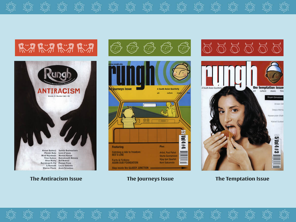
Covers of the Rungh print magazine issues with their unique colour swatch.
In addition to a colour swatch, each issue needed a graphic identity. We knew that we would not be able to keep all the design details of the print magazine with the transition to a digital format. But there were small elements that we agreed were representative of the print era and that would be clear visual cues on the website. For example, the circular “e” in the word “Editorial” in each opening letter, and the handprint at the close of each article before the author biography. The strongest visual element was the unique friezes running across the top of each page, designed with beauty and intent by Rungh co-founder Sherazad Jamal. These friezes were composed of graphics related to each the issue—such as the Food Issue with its lemon wedges; the Film and Video Issue with its film reel; or the Sanskrit svastika in the Home Issue (which reclaimed the symbol’s origins in well-being). Unlike the print magazines, which had multiple patterns within one issue, for the website we wanted continuity and selected only a single pattern in order to create a recognizable singular identity for each issue.
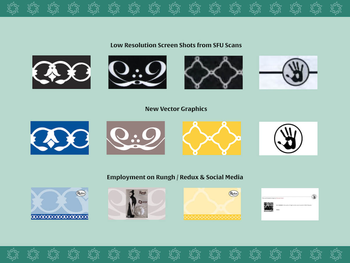
To create the friezes, we took a square or rectangular section from the full frieze that could be coded to repeat in a responsive website. No matter what the screen size of the device the reader is using, the frieze will always span the full width of the screen. Taking a screen shot of the high resolution SFU scanned print magazine PDFs, I cleaned them up into a vector image that could be sized up or down without losing resolution. This allowed us to be playful with our use of the image, incorporating it into different links around the site and on Rungh’s social media.

A sample of the frieze screen shots from the scanned PDFs from SFU and the cleaned-up vector graphics.
There were some gaps to be filled. When Rungh changed designers in 1997, the frieze element was dropped. I created a new frieze for each of these three issues. For the
Antiracism Issue, I sampled a different set of hands from the Body Issue (scans made from Jamal’s own hands), but that I felt were subtly in concert with the hands on the cover of the Antiracism Issue, an artwork by Winslow Delaney. These hands form a symbolic heart acting as a sign of the importance of love and community in opposing hate and violence. For the
Temptation Issue, I used the Taurus symbol that accompanies a review of Deepa Mehta’s film Earth, which I liked first for its references to the Zodiac, which is deeply connected to how people navigate relationships, attraction, and desire, and second for its bull horns, which can be easily mistaken for those of a devil, which is another symbol associated with temptation. In the
Journeys Issue, I wanted to keep something of the new design. In their opening letter of the Temptation Issue, the editors stated the desire to “update Rungh’s face” and to reflect the magazine’s “bold, thought provoking and fun” tone. The face of the youthful
pind (meaning “village” in the Punjabi language) boy, appearing on the front cover of the both issues in the right-hand corner of the magazine seemed fitting.

Covers of the Antiracism, Journeys, and Temptation Issues with the uniquely created frieze design above.
The frieze became an integral part of the project. Although a logo already existed for Redux, we felt that a general frieze design should be created as well. Something that could be used in conjunction with the logo as a decorative element. I liked the idea used in the
South Asian Publications Issue frieze that takes a different letter of the alphabet repeated four times into an abstract circular or floral design. Using the simple letter “R” for Rungh Redux, created a similar circular pattern that would also embrace the essential idea of Redux to “travel from past to present and back again.”

The "R" frieze graphic and some examples of its use in links around the Rungh site.
The design approach for Redux on the website was heavily informed by the print magazine. Redux became not just a reactivation project about the magazine articles, but also about design itself. In the same way that Rungh is continuously revisiting the past in order to inform or comment on the present (or vice versa), we found ourselves critically reviewing the design and deciding what to bring forward from the past and continue into the present, and what to leave behind in favour of a new direction.


